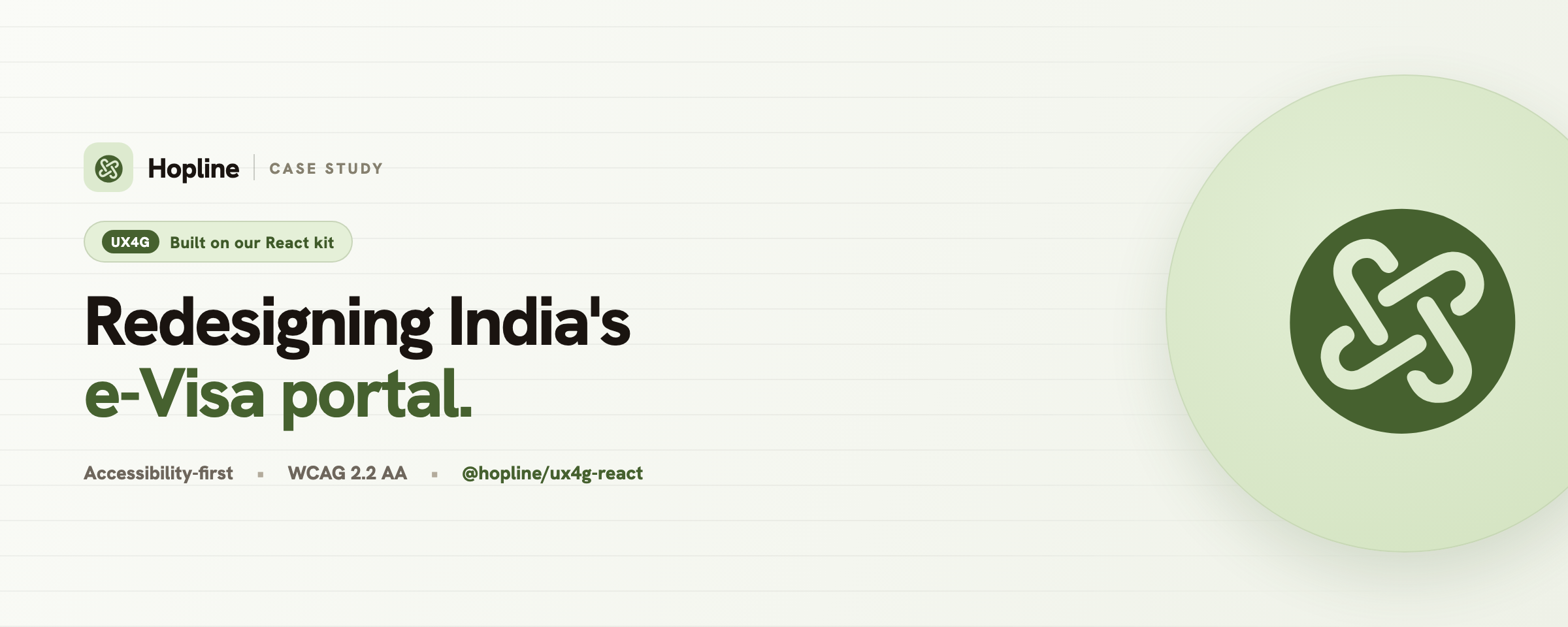
A design system earns its keep on the hard screens, not the demo ones. So after we
shipped UX4G for React, we set ourselves a test: take a real,
high-stakes government service and rebuild it using nothing but the kit. No Bootstrap,
no second UI library, no one-off CSS framework. Just @hopline/ux4g-react and its tokens.
We picked India’s e-Visa portal. It’s used by millions of travellers a year, it carries genuine legal and payment weight, and, candidly, it’s a hard interface to use today.
What was wrong with the original
The content on the live portal is all correct. The experience around it is the problem. “Apply” is one of seven near-identical grey buttons. Critical notices scroll past in an unpausable marquee. The layout is fixed-width desktop, so most travellers meet it by pinching and scrolling sideways on a phone. Help, advisories and four separate helplines are scattered across the page with no grouping. The thing is dense, dated, and hard to trust.
To be clear up front: this is an unofficial redesign concept. It’s an expert review, not field research, and we are not affiliated with the Government of India. We rebuilt it to learn something about our own tools.
What we built
Three things, all live on the docs site:
- A redesigned portal: a calm, task-first government layout that leads with one obvious action, keeps the notices as an accessible ticker that actually pauses, and reflows cleanly down to a phone.
- A four-step guided application: a stepper, a live summary rail, inline validation in plain language, and progress that saves itself as you go.
- A case study that walks through the problem, the research, the key decisions, the mobile behaviour, the accessibility work and a measurement plan.
You can read the full case study, or jump straight to the redesigned portal and the apply flow and resize the window.
What the kit made easy
This is the part we actually care about, because it’s the test we set.
Re-theming was one override. The original portal’s identity is a deep blue, not UX4G’s default violet. Because the system is built on a themeable colour ramp, switching the whole thing to a government blue was a single scoped override. Every button, link, focus ring, stepper and progress bar followed along, and the contrast stayed at AA.
Accessibility came for free. We didn’t bolt anything on. Visible focus halos, 44px targets, real labels with proper error wiring, a notices ticker that respects reduced-motion, and the GIGW and RPwD universal-access widget were all already in the components. For a government service, where accessibility is an obligation rather than a nice-to-have, that is the whole point.
The form was real components, not hand-rolled markup. Select, DatePicker, FileUpload, Checkbox, Stepper, Breadcrumb and Progress did the heavy lifting. The validation, the autosave and the layout are ours; the controls and their states are the kit’s.
The honest tally: every interface on those pages is composed from the package’s components and tokens. The only things we added were a small inline-SVG icon helper (the same approach UX4G ships internally) and plain CSS-grid layout. No component was forked or restyled.
The honest part
It’s a concept, not the live service. There’s no real backend behind the apply flow, and the insights come from expert review rather than testing with actual travellers. The next step, if this were going live, would be moderated usability sessions including people using screen readers and magnification.
Building on the kit this way paid off in the other direction too. Dogfooding the real
accessibility widget surfaced a bug we had shipped: its text-size controls scaled font-size
in a way that does nothing to our px-based components, so “bigger text” quietly did nothing. We
fixed it to scale with CSS zoom and released it in 0.3.3, so every UX4G app gets the fix. Using
your own kit on something hard is the fastest way to find what is wrong with it.
What we came away with is the answer we were looking for: the kit holds up on a hard, real-world service, and most of the work was design judgement rather than fighting the tools.
The kit is MIT-licensed and live. The code is on GitHub, every component is on the showcase, and if you’re building something for citizens and want a hand, say hello. A real person replies, and we usually respond very quickly.
Bishwajeet, co-founder of Hopline